Discover the business intelligence tools comparison: BI vs Tableau & Looker
Discover which platform wins in this business intelligence tools comparison of Power BI, Tableau, and Looker.
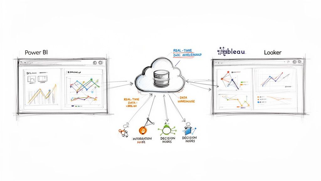
It’s no longer enough to just look in the rearview mirror. A close comparison of today’s top business intelligence tools—like Power BI, Tableau, and Looker—shows they’ve moved far beyond simple historical reporting. They’re now becoming genuine real-time decision-making engines, a critical shift for any company wanting to stay competitive.
The Modern Imperative for Business Intelligence
The old way of making today’s decisions with yesterday’s data just doesn’t cut it anymore. We operate in a world where customer behavior, market trends, and operational glitches can happen in a flash. This new reality demands a business intelligence strategy that’s dynamic and built on what’s happening right now.
Batch-processed reports, even if they’re only a few hours old, are a liability. The entire BI landscape is being reshaped by this need for speed. We’ve moved from simply visualizing what happened last quarter to generating live, actionable insights that let teams respond instantly. For the data engineers, analysts, and CTOs building these systems, the plumbing behind the BI tool is now just as crucial as the dashboard itself. Real-time data pipelines are no longer a “nice-to-have”; they’re the foundation.
Key Drivers of Modern BI Adoption
This isn’t just a niche trend; it’s a massive shift. Organizations are pouring money not just into BI software but into the entire infrastructure that powers it. The main drivers are pretty clear:
- Exploding Data Volume: We’re collecting more data from more sources than ever before, and it all needs to be processed immediately.
- A Shift to Proactive Decisions: Companies are tired of reacting to problems. They want to use live data to get ahead of issues and pounce on opportunities.
- Higher Customer Expectations: Customers want instant answers and personalized service, which is impossible without real-time data feeding your systems.
The market growth tells the story. The global BI market is expected to hit $72.1 billion in the next year, with the U.S. market alone making up $27.3 billion of that. Adoption rates have climbed to 26% worldwide, and nearly half of all businesses have ramped up their BI spending since the pandemic. You can find more details on the business intelligence software market on ibisworld.com.
Today, a BI tool’s value isn’t just in its slick charts. It’s measured by the speed and quality of the decisions it helps you make. Without a real-time data foundation, even the most powerful platform is running with a serious handicap.
This guide will break down three of the biggest names in the game: Power BI, Tableau, and Looker. We’ll get into the weeds of how each platform handles the demand for live data, offering a comparison that goes much deeper than a simple feature list.
Comparing Power BI vs Tableau vs Looker
When it’s time to choose a business intelligence platform, you’ll quickly find yourself looking at three heavyweights: Microsoft Power BI, Salesforce Tableau, and Google Looker. They all promise to transform your raw data into smart decisions, but they get there in very different ways. A real comparison goes beyond just a feature checklist; it’s about understanding their core philosophies and where they truly shine.
Think of them as distinct paths to data clarity. Power BI is the natural choice for organizations deeply embedded in the Microsoft ecosystem, offering an almost unbeatable level of integration and ease of access. Tableau has long been the artist’s tool, the leader in pure visual analytics and crafting compelling data stories. Looker, on the other hand, comes at it from a different angle, prioritizing rock-solid governance and scalability through its unique data modeling layer, LookML.
This breakdown will pull back the curtain on each tool, looking at the critical capabilities that matter. The goal is to give you a clear framework for deciding which one best fits your company’s tech stack, data culture, and long-term vision.
The BI market isn’t just growing; it’s exploding. This makes picking a tool that can scale with you more important than ever. The numbers below paint a pretty clear picture of where the industry is headed.
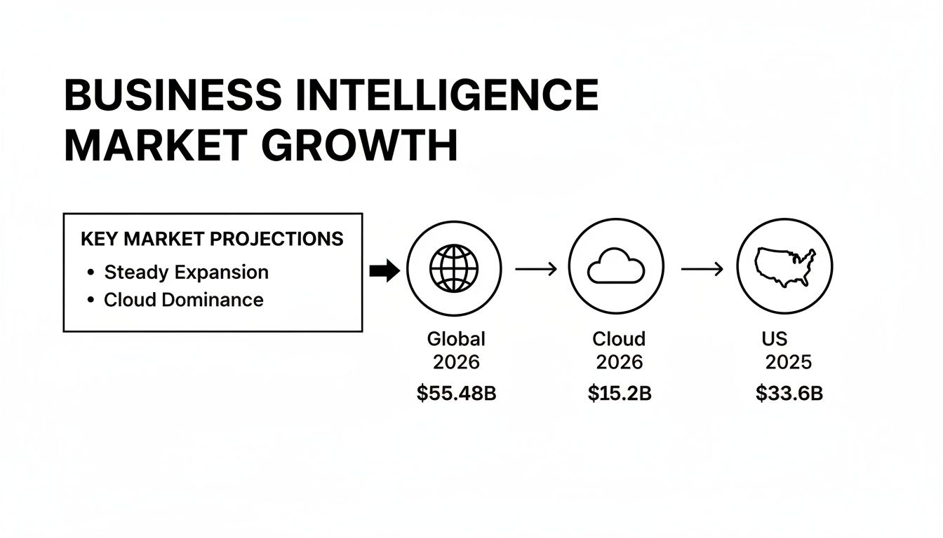
These projections show that investment in BI is accelerating, with cloud-based platforms leading the charge. Your choice today has major implications for your data strategy tomorrow.
At-a-Glance Feature Matrix: Power BI vs Tableau vs Looker
Before diving deep, here’s a high-level look at how these three giants stack up. This table provides a quick reference for their core strengths, typical users, and where they feel most at home.
| Feature/Aspect | Microsoft Power BI | Salesforce Tableau | Google Looker |
|---|---|---|---|
| Primary Strength | Deep Microsoft ecosystem integration, ease of use for business users. | Best-in-class data visualization and storytelling capabilities. | Centralized data modeling (LookML), governance, and scalability. |
| Ideal User | Business analysts, Excel power users, and enterprise Microsoft shops. | Data artists, analysts, and teams focused on visual exploration. | Data teams, developers, and organizations needing a “single source of truth.” |
| Data Handling | Primarily an in-memory engine (VertiPaq) with DirectQuery options. | Flexible: in-memory (Hyper engine) or live connection to sources. | 100% in-database; generates SQL and queries the source warehouse directly. |
| Self-Service Model | Highly accessible, especially for users familiar with Excel (Power Query). | Strong visual exploration, but creating new sources is more technical. | “Governed self-service” where users explore within pre-built models. |
| Learning Curve | Low for basic reporting; moderate for advanced data modeling (DAX). | Moderate, with a high ceiling for mastering advanced visual techniques. | High initial setup for data teams (LookML); low for business users. |
| Ecosystem | Tightly integrated with Azure, Office 365, Dynamics, and Fabric. | Salesforce CRM integration is strong, but it remains largely platform-agnostic. | Native to Google Cloud (BigQuery) but designed to work with any SQL DB. |
This matrix highlights the fundamental differences in their approach. Power BI is about accessibility, Tableau is about creativity, and Looker is about control and consistency.
Data Connectivity and Integration
A BI tool is useless if it can’t get to your data. The ability to connect to a wide range of sources—from old-school SQL databases to modern cloud warehouses and SaaS apps—is table stakes.
Power BI plays incredibly well within its home turf. It offers native, high-performance connectors for the entire Azure suite, including Azure Synapse Analytics, SQL Database, and Databricks. If your organization runs on Office 365 and Dynamics 365, the integration feels effortless. While it can connect to hundreds of other sources, it’s at its absolute best inside the Microsoft world.
Tableau, on the other hand, prides itself on being a universal translator for data. It boasts one of the most extensive libraries of native connectors out there, easily linking to everything from a simple spreadsheet to cloud powerhouses like Snowflake, Redshift, and Google BigQuery. Its acquisition by Salesforce has naturally deepened its ties to the Salesforce CRM ecosystem, but it remains a fundamentally platform-agnostic tool.
Looker is a bit different. As part of Google Cloud, it has optimized connectors for BigQuery, but its core architecture is database-agnostic. Here’s the key: Looker doesn’t pull data into its own engine. Instead, it generates SQL queries on the fly and pushes them down to your database. This “in-database” approach means its speed is directly tied to the performance of your data warehouse, making it a perfect match for modern powerhouses like Snowflake or BigQuery.
Visualization and Dashboarding
Ultimately, BI is about communication. Visualizations are how you tell the story hidden in your data, and each tool has a distinct philosophy on how to do it.
Tableau is widely hailed as the gold standard here. It gives data analysts an incredible amount of creative freedom and fine-grained control, letting them build stunning, pixel-perfect dashboards. The drag-and-drop interface is simple enough to get started, but it has immense depth for data artists who want to craft truly interactive and compelling narratives.
If data storytelling and visual polish are top priorities for your team, Tableau is hard to beat. Its ability to create beautiful and highly interactive dashboards is a major factor in driving user adoption and engagement.
Power BI offers a powerful and very user-friendly visualization experience. It comes with a massive library of standard and custom visuals, and you can build clean, functional, and interactive reports very quickly. It may not have the same artistic flexibility as Tableau, but its tight integration with Excel means users can bring their existing skills right into building dashboards.
Looker approaches visualization from a place of governance. Dashboards and charts are built on top of the pre-defined data models created in LookML. This ensures everyone across the company is looking at the same metrics, defined in the same way. It trades some creative freedom for consistency. Its visualization options are more straightforward than Tableau’s, but they are designed to be reliable and deliver standardized, trustworthy reports every time.
Self-Service Analytics and Ease of Use
One of the biggest promises of modern BI is empowering business users to find their own answers without waiting for the data team. How well a tool delivers on this promise often determines whether it gets used or becomes shelfware.
Power BI is often considered the most approachable tool for business users, particularly anyone who has ever wrangled a VLOOKUP in Excel. Its intuitive interface and the powerful Power Query feature allow non-technical folks to perform fairly complex data prep and analysis with ease. This accessibility is a huge reason for its rapid growth.
In the BI tools arena, Microsoft Power BI is the clear market leader, holding over 30% market share as of 2021. With more than 215,856 company installs and 204,512 active deployments, it’s well ahead of competitors like Tableau, which has around 17% market share. To see more data on platform adoption, you can discover detailed market insights at scoop.market.us.
Tableau also provides strong self-service options. Its “Explorer” user type lets business users play with, filter, and customize existing dashboards and data sources that have been prepared by “Creators.” While exploring data is very intuitive, setting up a new data source from scratch requires more technical skill than in Power BI.
Looker offers a unique spin on self-service that is centered on its data model. Business users can freely explore data, but only within the governed framework built in LookML. They can drag in new dimensions and measures, build their own charts, and save reports—all without writing a single line of SQL. This “governed self-service” prevents the chaos that can happen when everyone defines “revenue” differently. It does, however, require a significant upfront investment from a data team to build that robust model in the first place.
Real-Time Architecture and Performance
A beautiful dashboard showing last week’s data is an artifact, not an insight. When you’re comparing business intelligence tools, the real game-changer is how each platform handles the constant demand for live, up-to-the-second information. The architecture under the hood is what determines whether your dashboards show you reality or just recent history.
The main challenge is how these BI tools actually connect to their data sources. Traditional setups often rely on scheduled refreshes, which means your data is always a little stale. But modern BI needs a far more dynamic connection to keep up with the business.
This means we have to move past old-school batch processing. If you want to get into the weeds on how these two approaches compare, our guide on real-time processing vs. batch processing is a great place to start. Getting this right is crucial for picking a tool that can actually deliver insights when they matter.
Connection Modes: DirectQuery vs. Live vs. Extract
Every major BI platform gives you different ways to get at your data, and each comes with some serious performance trade-offs.
Microsoft Power BI gives you two main options:
- Import Mode: This pulls your data into Power BI’s incredibly fast VertiPaq engine. It’s fantastic for snappy query performance but needs scheduled refreshes, which kills any hope for true real-time analysis.
- DirectQuery: Here, Power BI sends queries straight to the source database every time a user clicks something. This gets you near real-time dashboards but can put a massive strain on that source database.
Tableau offers a similar choice:
- Extract: Much like Power BI’s Import mode, data is loaded into Tableau’s own Hyper engine. This makes complex analysis fly but depends on periodic updates.
- Live Connection: Queries are sent directly to the source. This is your ticket to real-time analytics, but your dashboard’s speed is completely at the mercy of your data warehouse.
Looker is the odd one out here, by design. It’s 100% in-database, which means it never actually ingests or stores your data. Every chart you see is a live SQL query running against your warehouse. This makes its real-time capability directly tied to how fast your warehouse can respond.
If your organization needs to know what’s happening right now, a “Live” or “DirectQuery” connection is a must. But be warned: this approach can absolutely crush your source databases if you don’t architect your pipeline correctly. That’s why having an analytics-optimized data warehouse in the middle is so important.
The Critical Role of Change Data Capture
Trying to run live analytical queries directly against your operational databases is a recipe for disaster. Hitting a system built for fast transactions with complex, heavy queries will slow down the application for your actual users. This is where a modern data architecture is non-negotiable.
The solution is to separate your analytics from your operations using Change Data Capture (CDC). CDC is a technique that spots and captures data changes in a database (inserts, updates, deletes) and streams those changes to another system in real time.
This diagram shows how a CDC pipeline can deliver real-time BI without destabilizing the source systems that run your business.
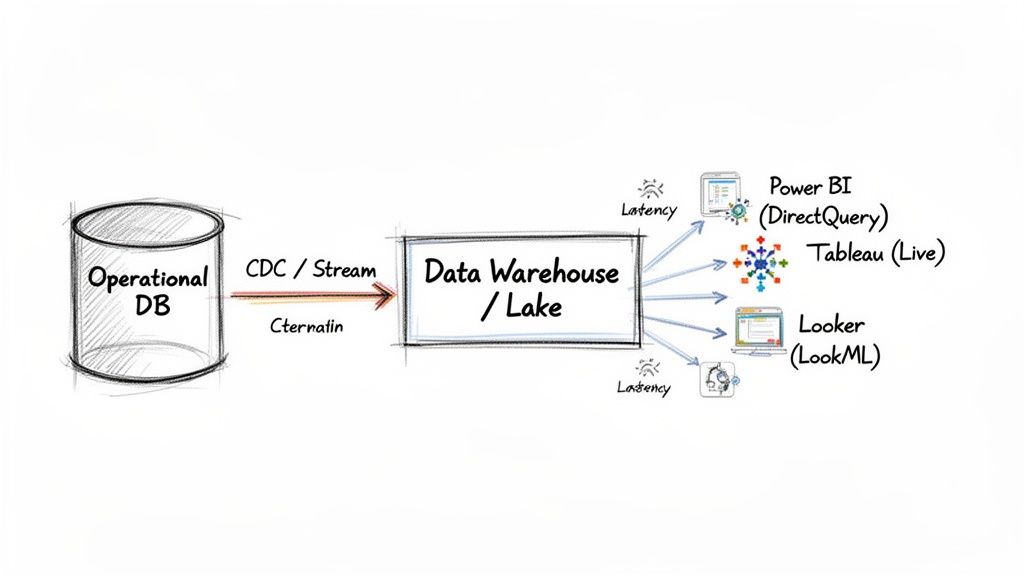
In this setup, a tool like Streamkap reads every change from the source database log. It then streams these events into a cloud data warehouse like Snowflake or BigQuery with millisecond latency.
Enabling High-Performance Real-Time BI
This kind of architecture completely changes what your BI tools can do. Instead of hammering a strained operational database, Power BI (in DirectQuery mode) or Tableau (with a Live connection) now talks to a high-performance data warehouse that is always perfectly in sync.
This model gives you the best of both worlds:
- Real-Time Data: Your dashboards reflect what’s happening in the business, second by second.
- Source System Isolation: Your production applications run smoothly, completely unaware of the heavy analytical lifting happening elsewhere.
- Scalable Performance: Cloud data warehouses are built from the ground up to handle complex queries from many users at once.
Ultimately, the performance of any modern BI tool has less to do with the tool itself and more to do with the data architecture that supports it. Without a real-time pipeline feeding a powerful warehouse, even the fanciest platform will fall flat. For a closer look at the demands of high-performance scenarios like real-time data processing, you can read more here. By putting a CDC-powered architecture in place, you can finally unlock your BI tool’s true potential, turning it from a rear-view mirror into a real-time decision-making engine.
Analyzing Pricing Models and Total Cost of Ownership
It’s easy to fall into the trap of choosing a BI tool based on its advertised price. That initial license fee, however, is just the tip of the iceberg. The real financial picture emerges when you look at the Total Cost of Ownership (TCO), which rolls in everything from per-user fees and infrastructure to training and the day-to-day operational costs of keeping the system running.
A smart comparison of business intelligence tools has to pull apart these often-complex pricing structures. Microsoft Power BI, Salesforce Tableau, and Google Looker each approach pricing differently, with models built for different scales and user types. Getting a handle on these nuances is the first step to building a realistic budget and sidestepping any nasty financial surprises later on.
Breaking Down the License Tiers
Each of these platforms uses a tiered, role-based licensing system that can dramatically change your final bill. The key is to accurately map your team’s actual needs to the right license type, so you’re not overpaying for features you don’t use or hamstringing your team with too few capabilities.
-
Microsoft Power BI: Power BI keeps things relatively simple. Power BI Pro is for individual users who need to publish and share reports, priced on a straightforward per-user, per-month basis. For bigger companies, Power BI Premium offers dedicated capacity, which lets you distribute content to unlimited free viewers and delivers better performance, but it comes with a much steeper monthly price tag.
-
Salesforce Tableau: Tableau’s model is built around user roles. Creators are the power users who design data sources and build dashboards—they have the most expensive license. Explorers can dig into existing reports and make edits, while Viewers have read-only access at the most affordable tier. You really need a clear headcount of who does what to price this out accurately.
-
Google Looker: Looker’s pricing is often more opaque and highly customized. It usually involves a base platform fee plus costs tied to the number of users and the size of your instance. This structure is really geared toward large-scale enterprise deployments where data governance and scalability are top priorities, making it a serious upfront investment.
Beyond the License: Hidden Costs and TCO
The license fee is just one line item. The true TCO is packed with other critical expenses that can quickly add up, turning what seemed like an affordable tool into a long-term financial drain.
The tool’s architecture is a huge factor here. With most leading BI platforms being cloud-based SaaS products, a good understanding of mastering SaaS pricing strategies can help you gauge their long-term value. Think about how each platform will impact your overall cloud spend. Looker’s in-database approach, for example, can drive up your data warehouse query costs, while Power BI’s reliance on its own engine might push you toward investing more in dedicated capacity.
The biggest hidden cost in any BI project is almost always the human element. The hours your data engineers sink into setup, maintenance, and training won’t show up on any vendor invoice, but they have a massive impact on the real TCO.
Don’t forget to factor these other essential costs into your calculations:
- Infrastructure and Hosting: Are you hosting it yourself or using a managed cloud service? Each path has completely different cost implications.
- Data Pipeline and Integration Tools: You have to get your data into the BI tool somehow. Services like real-time CDC platforms add to the bill but can also cut down on other expenses. To get a sense of how this piece fits, check out Streamkap’s pricing and plans.
- Developer and Analyst Training: Every platform has its own language and learning curve (like DAX for Power BI or LookML for Looker), which means you’ll need to invest in upskilling your team.
- Ongoing Administration and Support: Someone needs to manage user permissions, handle updates, and troubleshoot issues. This administrative overhead is a constant operational cost.
How to Choose the Right BI Tool for Your Team
Picking the right BI tool isn’t just about ticking boxes on a feature list. The best platform is the one that actually fits how your team works, what your tech stack looks like, and the kind of data culture you’re trying to build. Instead of a generic “best-of” list, let’s look at specific scenarios to help you land on the right choice for your company.
It’s a big decision, and it helps to understand the market you’re buying into. The BI world has seen massive consolidation, with titans like Microsoft Power BI (with 215,856 installs) and Salesforce’s Tableau (with 141,136 installs) dominating the space. In the US alone, Microsoft and Salesforce pull in $13.5B and $5.4B respectively from this segment.
This market structure has real-world implications, especially for data engineers. Power BI’s tight integration with the Microsoft ecosystem can slash setup time, a factor you can’t ignore. If you want to dive deeper into the vendor landscape, HG Insights offers some great market analysis.
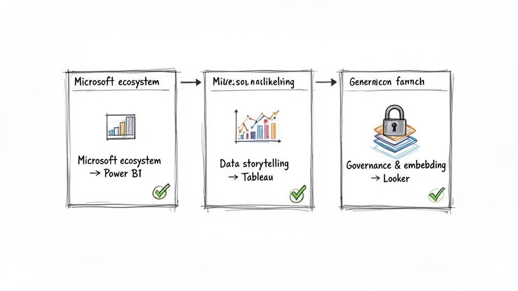
When to Choose Microsoft Power BI
For any organization already living and breathing in the Microsoft world, Power BI is the clear frontrunner. If your team is built on Azure, Office 365, and Dynamics 365, adopting Power BI feels less like a decision and more like the next logical step.
Go with Power BI if your team:
- Needs to get business users self-serving, fast. The interface is famously Excel-like, particularly with Power Query. This familiarity drastically shortens the learning curve for non-technical staff.
- Wants a smooth, low-friction deployment. Its native connectors to Azure Synapse, SQL Database, and other Microsoft products are rock-solid and make the integration process feel almost seamless.
- Is looking for a cost-effective way to scale. The pricing model, which combines Power BI Pro for creators and Power BI Premium for enterprise-wide distribution, offers a flexible and often more budget-friendly path to company-wide adoption.
When to Select Salesforce Tableau
Tableau carved out its place in the market by doing one thing exceptionally well: data visualization. If the main goal is to let analysts freely explore data and build compelling visual stories, Tableau is still the gold standard. Think of it as the artist’s canvas of the BI world.
Tableau is the right call when your organization:
- Prioritizes data storytelling and visual craft. Tableau gives you meticulous control over every chart, graph, and dashboard element, letting you create beautiful and persuasive interactive experiences.
- Operates with a diverse, non-Microsoft tech stack. While its Salesforce integration is now top-notch, Tableau’s real advantage is its ability to connect to almost anything—from cloud warehouses like Snowflake to a simple CSV file—without locking you into a single vendor’s ecosystem.
- Encourages a culture of deep, curiosity-driven data exploration. Tableau makes it intuitive for users to ask complex questions visually, leading to a much more profound discovery process than many other tools. Our guide on business intelligence dashboard examples highlights the kind of rich visualizations you can build.
Key Takeaway: The decision often boils down to ecosystem vs. creativity. Power BI is a home run for its seamless Microsoft integration and ease of use, while Tableau shines with its pure-play visual analytics and platform flexibility.
Why Opt for Google Looker
Looker (now part of Google Cloud) is the strategic pick for data-mature organizations where governance, consistency, and a “single source of truth” are absolutely critical. Its power comes from LookML, a centralized data modeling layer that ensures every metric is defined the same way for everyone, everywhere.
Choose Looker if your main objectives are:
- Establishing ironclad data governance. LookML is where your data team defines all business logic centrally. This puts an end to the chaos of conflicting metrics and gives business users self-service analytics they can actually trust.
- Embedding analytics directly into your own products. Looker was practically built for embedded use cases. It’s the go-to for SaaS companies that want to offer powerful, customer-facing dashboards without building them from scratch.
- Capitalizing on a modern, in-database architecture. Looker doesn’t extract and store your data. Instead, it generates clean, optimized SQL and queries your cloud data warehouse directly. This makes it a perfect match for high-performance platforms like BigQuery, Snowflake, and Redshift, ensuring you’re always working with real-time data at scale.
Frequently Asked Questions
When you’re deep in the process of comparing BI platforms, a lot of practical questions start to pop up. Let’s tackle some of the most common ones about implementation, scalability, and what “real-time” actually means in this context. Getting these answers straight can help you cut through the marketing noise and avoid potential roadblocks down the line.
What’s The Main Difference Between BI Tools?
At their core, the biggest difference comes down to architecture and design philosophy. You have tools like Microsoft Power BI and Tableau that rely on powerful in-memory engines (VertiPaq and Hyper, respectively). This approach makes them incredibly fast for analyzing imported data, but it also means you’re always working with a snapshot that needs scheduled refreshes.
On the other end of the spectrum is a tool like Looker. It operates entirely in-database, which means it translates user actions into live SQL queries that run directly against your data warehouse. There’s no data import; you’re always looking at the raw, current data.
This single architectural choice impacts everything. Power BI feels familiar and accessible, especially for users coming from an Excel background. Looker, with its centralized LookML data modeling layer, is built for strict governance and data consistency. And Tableau has always carved out its niche with unmatched visual flexibility, making it a favorite for creative data storytelling.
How Long Does It Take to Implement a BI Tool?
This is the classic “it depends” question, but the variables are pretty clear. The timeline can shift dramatically based on a few key factors:
- Data Complexity: This is the big one. How clean is your data? How much of it is there? Where does it live? Hooking up a few well-structured sources is a matter of weeks. Untangling a messy, multi-source data environment can take months.
- Team Skillset: If your team already has experience with data modeling and the BI tool you’ve chosen, you’ll get up and running much faster.
- Organizational Scale: Rolling out to a single department is a completely different beast than an enterprise-wide deployment that requires complex permissions, row-level security, and multiple integrations.
A focused, departmental project might take 4-6 weeks. A large-scale enterprise implementation, complete with heavy data prep and user training, could easily stretch to 6 months or more. The secret to a faster rollout is starting with a very specific scope and a clear business goal you’re trying to achieve.
Are All BI Tools Capable of Real-Time Analytics?
Not out of the box, no. A BI tool’s ability to be “real-time” hinges on two things: its connection mode and the data pipeline feeding it. Sure, tools like Tableau and Power BI have “Live” or “DirectQuery” modes that query the source directly. But that connection is only as fresh as the data in the source itself.
True real-time BI isn’t really about the visualization tool. It’s about the data architecture that supports it. Without a real-time data pipeline powered by something like Change Data Capture (CDC), even a “live” connection will just show you stale data, faster.
To get dashboards that reflect what’s happening in your business right now, you have to connect your BI platform to a system that streams changes from your operational databases into your data warehouse with minimal delay. That’s how you ensure your metrics update second by second, not just hour by hour.
Ready to power your dashboards with truly live data? Streamkap is a real-time CDC platform that syncs data from your operational databases to your warehouse with millisecond latency. This is what unlocks the full, real-time potential of your BI tools. Learn more about building a real-time data pipeline with Streamkap.
Related resources
Sub-50ms Data Streaming for AI Agents: Benchmarks, Architecture, and Platform Comparison
Compare real-time data streaming platforms by latency performance for AI agent workloads. See how sub-50ms delivery changes agent decision quality and accuracy.
Streaming to Vector Databases: Comparing Managed Platforms for AI Teams
Compare managed streaming platforms for building real-time pipelines to vector databases. Covers Pinecone, Weaviate, Qdrant, and pgvector integration patterns.
Best CDC Platform for AI Workloads: What to Look For
Evaluating CDC platforms for AI and GenAI use cases? Compare Streamkap, Confluent, Estuary, Fivetran, Airbyte, AWS DMS, and Striim across latency, transforms, agent support, and cost.