Top Business Intelligence Dashboard Examples for 2025
Discover key business intelligence dashboard examples to inspire your data visualization and decision-making in 2025.

In a world flooded with data, the right business intelligence dashboard is more than a collection of charts; it’s your command center. It transforms raw numbers into a clear narrative, guiding strategic decisions and revealing hidden opportunities. Yet, moving from concept to a truly effective dashboard can be challenging. Where do you start? What metrics matter? How do you design for clarity and impact?
This guide moves beyond generic advice by dissecting real-world business intelligence dashboard examples from leading platforms like Tableau, Power BI, and Looker Studio. We won’t just show you what they look like; we will break down the strategic thinking behind each layout, identify replicable tactics, and provide actionable takeaways. Each review includes annotated screenshots and direct links to the source gallery, giving you a blueprint for creating dashboards that don’t just report data but drive decisive action.
You will learn how to structure dashboards for specific roles, from marketing analysts to CTOs, ensuring the right information reaches the right people. While this article covers broad business intelligence, specialized dashboards are crucial for specific functions. For a deeper dive into one critical area, you can explore seven top financial dashboard examples for success in 2025. Now, let’s explore the best examples to inspire your next data visualization project.
1. Tableau – Dashboard Examples and Public Gallery
Tableau’s official website serves as a masterclass in business intelligence, offering a rich, curated gallery of dashboard examples. Unlike simple image galleries, Tableau provides fully interactive, live dashboards that allow users to explore data stories firsthand. This hands-on approach is invaluable for understanding the practical application of data visualization principles.
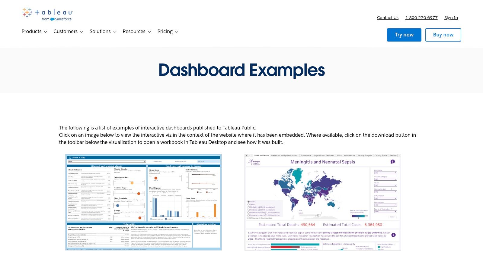
The platform’s key differentiator is its emphasis on learning and replication. Many of the showcased examples include downloadable workbooks, enabling analysts and data engineers to reverse-engineer complex visualizations within Tableau Desktop. This hands-on capability accelerates the learning curve for building sophisticated and effective business intelligence dashboard examples.
Strategic Breakdown & Key Takeaways
Tableau’s gallery is not just for inspiration; it’s a strategic resource for skill development. By deconstructing expert-built dashboards, users can absorb best practices in layout, color theory, and chart selection. The platform also features the “Viz of the Day” and a massive Tableau Public gallery, providing a continuous stream of fresh ideas from a global community.
Actionable Insights:
- Reverse-Engineer for Success: Download a workbook from the gallery that aligns with your business needs. Analyze its data sources, calculated fields, and dashboard actions to understand its construction.
- Focus on Interactivity: Pay close attention to how the best dashboards use filters, parameters, and tooltips to create an intuitive and engaging user experience.
- Leverage Community Knowledge: Explore the Tableau Public gallery to see how others are solving data visualization challenges, especially for real-time data analytics. Learn more about the nuances of real-time data dashboards and their strategic implementation.
Platform Details
FeatureDescriptionPrimary OfferingA curated gallery of interactive, professional business intelligence dashboards.Unique FeatureDownloadable workbooks (.twbx files) allow users to deconstruct and learn from expert designs.Access & PricingViewing examples is free. Downloading and editing workbooks require a licensed copy of Tableau Desktop.Best ForAnalysts, BI developers, and data scientists looking for tangible examples and hands-on learning.
Website: https://www.tableau.com/dashboard-examples
2. Google Looker Studio – Official Report/Template Gallery
Google’s Looker Studio (formerly Data Studio) provides a highly accessible gallery of report templates, making it an excellent starting point for those building their first business intelligence dashboard examples. The gallery features both official Google-made templates and community submissions, covering a wide range of use cases from marketing analytics to financial reporting. Its biggest strength lies in its seamless, one-click integration with the Google ecosystem.
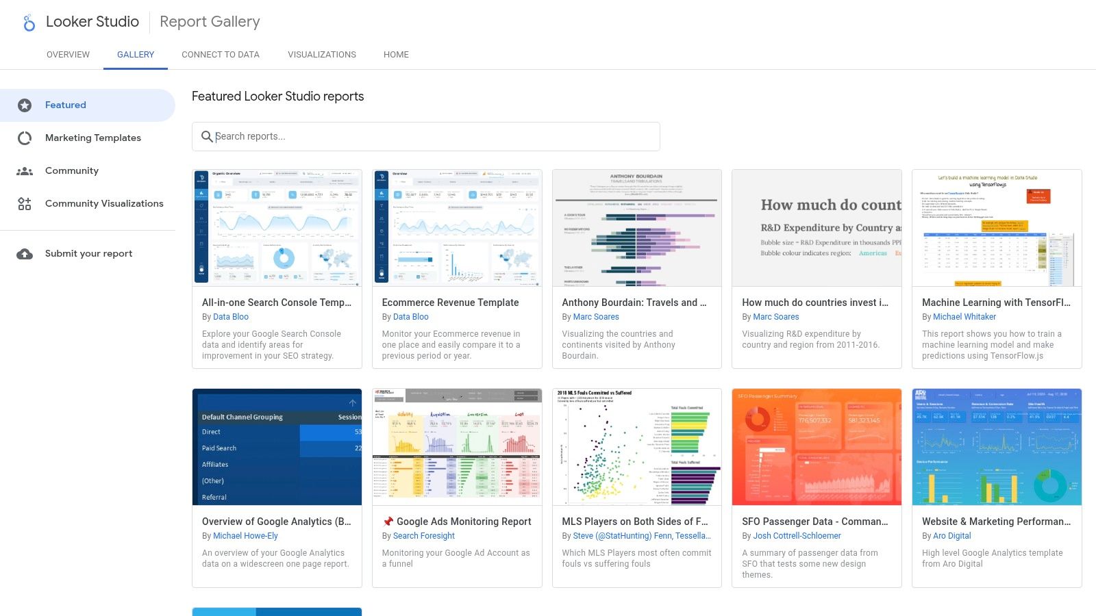
The platform’s key differentiator is its frictionless “Use template” functionality. Users can select a dashboard example, connect their own data sources like Google Analytics 4, Google Ads, or a BigQuery table, and instantly generate a populated, functional report. This dramatically lowers the barrier to entry, allowing teams to move from inspiration to a working dashboard in minutes rather than days.
Strategic Breakdown & Key Takeaways
The Looker Studio Gallery is a strategic asset for rapid prototyping and deployment, especially for marketing and web analytics teams. By leveraging pre-built templates, analysts can bypass the initial design phase and focus immediately on data interpretation and customization. The variety of community-submitted reports also offers creative solutions to common data visualization challenges.
Actionable Insights:
- Accelerate Deployment: Find a template that matches your primary data source (e.g., GA4 or YouTube Analytics). Use it to create a baseline dashboard, then customize it by adding your company branding and specific KPIs.
- Evaluate Data Connectors: Pay attention to which data sources a template uses. While many connect to free Google sources, some community examples require paid third-party connectors for platforms like Shopify or Facebook Ads.
- Learn Structuring: Analyze how official Google templates structure their pages and data narratives. Note their use of summary pages for high-level overviews and detailed drill-down pages for granular analysis.
Platform Details
FeatureDescriptionPrimary OfferingA gallery of free, customizable report templates with direct data source integration.Unique FeatureOne-click “Use template” function that allows users to instantly copy and connect their own data.Access & PricingThe gallery and use of templates are completely free. Some connectors may require a separate subscription.Best ForMarketing analysts, small businesses, and teams heavily invested in the Google data ecosystem.
Website: https://lookerstudio.google.com/gallery
3. Microsoft AppSource – Power BI Apps and Template Apps
Microsoft AppSource is the official marketplace for Power BI, functioning as a curated ecosystem of template apps and partner solutions. Instead of just showcasing static images, it offers complete, installable dashboard packages. Users can browse these business intelligence dashboard examples, install them directly into their Power BI environment with sample data, and then connect their own data sources for immediate application.
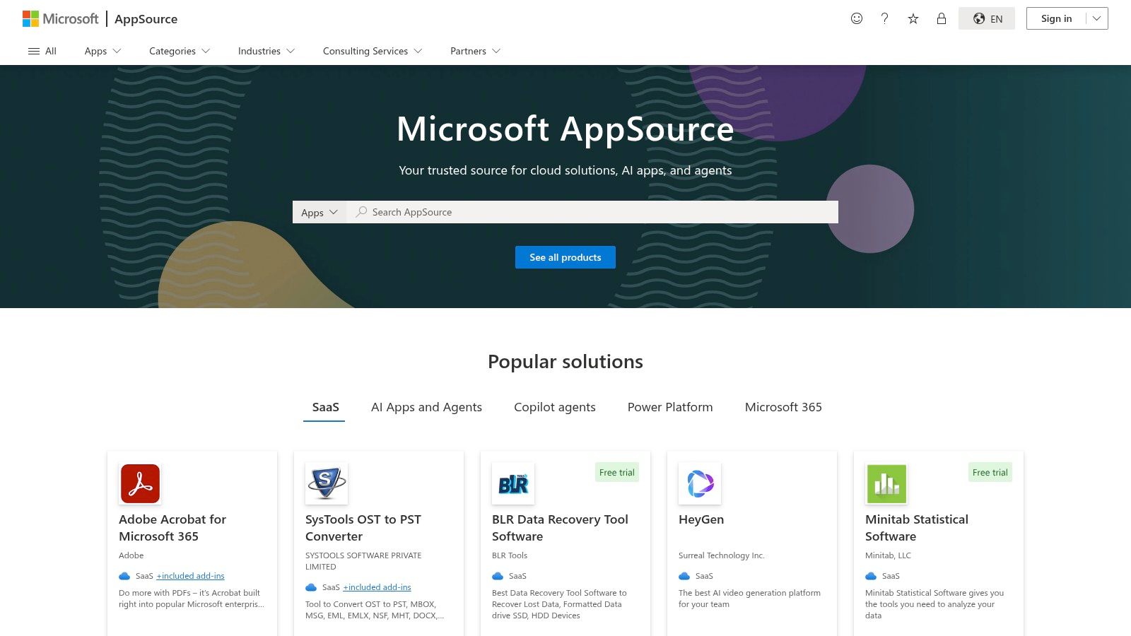
The platform’s key differentiator is its seamless integration and “plug-and-play” nature. The apps are not just inspirational visuals; they are fully functional, pre-built solutions often tailored to specific industries (like retail or finance) or business functions (like sales or marketing). This approach drastically reduces the time to value, allowing organizations to deploy sophisticated dashboards without building them from scratch.
Strategic Breakdown & Key Takeaways
AppSource serves as a strategic accelerator for organizations invested in the Microsoft ecosystem. By leveraging partner-built templates, teams can bypass the initial design and development phases, focusing instead on data integration and customization. The marketplace’s rating and review system provides social proof, helping users identify high-quality, reliable solutions vetted by the community.
Actionable Insights:
- Test Before You Invest: Install a template app using its sample data first. Evaluate its reports, data model, and user experience to ensure it aligns with your requirements before connecting your own sensitive data.
- Filter for Your Niche: Use the platform’s robust filtering options to find apps specific to your industry, business role, or required data connectors (e.g., Salesforce, Google Analytics).
- Customize Pre-Built Models: Once an app is installed, use it as a powerful baseline. Customize the visuals, add new report pages, and modify the underlying DAX calculations to tailor it perfectly to your company’s KPIs.
Platform Details
FeatureDescriptionPrimary OfferingA marketplace of installable Power BI template apps with pre-built reports, dashboards, and data models.Unique FeatureDirect, one-click installation into a user’s Power BI environment, often bundled with sample data.Access & PricingBrowsing is free. Installing apps requires a Power BI Pro or Premium license. Many apps are free or offer trials.Best ForPower BI users, IT managers, and business analysts seeking quick-to-deploy, industry-specific dashboard solutions.
Website: https://appsource.microsoft.com
4. Qlik – Dashboard Examples by Industry and Role
Qlik offers a highly practical hub of interactive dashboard examples, strategically categorized by industry and job function. This approach allows users to immediately find relevant business intelligence dashboard examples that mirror their own professional challenges, from a CFO analyzing profitability to a supply chain manager tracking logistics. The platform provides interactive demos that showcase its unique Associative Engine, allowing users to make selections and see the entire data landscape instantly update.
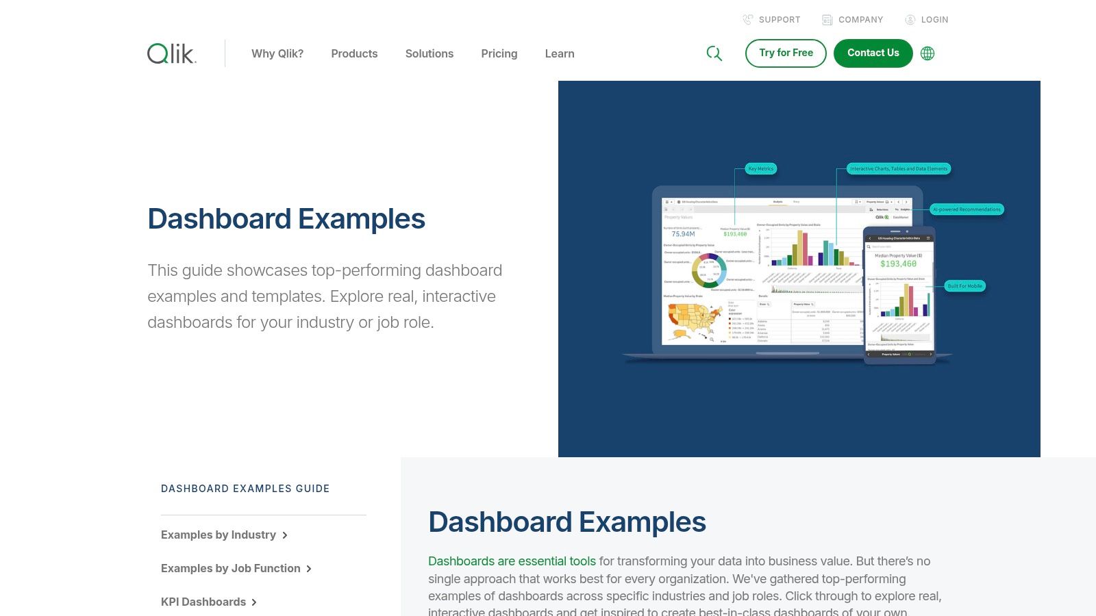
The key differentiator for Qlik’s gallery is its focus on specific, real-world use cases. Instead of just presenting visually appealing charts, each example is a field-tested layout designed to solve a particular business problem. While the dashboards are not downloadable templates, they serve as powerful blueprints for designing effective BI solutions and understanding the flow of information necessary to support them.
Strategic Breakdown & Key Takeaways
Qlik’s gallery is an excellent resource for pattern recognition and conceptual design. By exploring dashboards tailored to their role (e.g., Sales, HR, Finance), users can quickly grasp which KPIs and visualizations are most effective for specific objectives. The platform also features demo videos and guides that explain the concepts behind the dashboards, bridging the gap between inspiration and implementation.
Actionable Insights:
- Study Role-Based Layouts: Select the dashboard for your job function (e.g., Marketing Analytics) and analyze the chosen KPIs, chart types, and data granularity. This provides a proven template for your own projects.
- Understand Data Association: Interact with the demos by clicking on different data points. Observe how Qlik’s Associative Engine highlights related and unrelated data across all charts, a powerful feature to replicate in your own BI tools.
- Map to Your Data Flow: Use the examples to conceptualize the data relationships required for your own dashboards. This can help in designing more robust systems. Learn more about the critical role of data pipeline architectures in supporting advanced BI.
Platform Details
FeatureDescriptionPrimary OfferingInteractive dashboard demos and KPI layouts organized by industry (e.g., retail, healthcare) and role.Unique FeatureShowcases the Qlik Associative Engine, allowing users to explore data relationships in real time.Access & PricingViewing all examples and demos is free. Full platform usage requires a Qlik subscription or free trial.Best ForBusiness leaders, department managers, and analysts seeking industry-specific dashboard design patterns.
Website: https://www.qlik.com/us/dashboard-examples
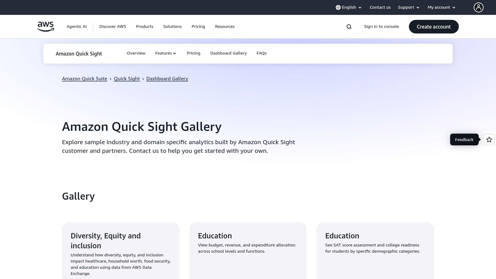
5. Amazon QuickSight – Dashboard Gallery
Amazon QuickSight, AWS’s cloud-native BI service, offers a dedicated gallery that showcases dashboard examples across various industries and specific AWS use cases. The gallery provides interactive demos that allow users to explore functionality, from sales pipeline analysis to IoT fleet monitoring. This is particularly valuable for organizations already embedded within the AWS ecosystem.
The platform’s key differentiator is its seamless integration with AWS data sources like S3, Redshift, and Athena. The gallery highlights this by featuring practical, real-world business intelligence dashboard examples, such as AWS Cost and Usage dashboards. These examples serve as powerful blueprints for building effective FinOps and operational monitoring tools directly within the AWS environment.
Strategic Breakdown & Key Takeaways
The QuickSight gallery is a strategic starting point for teams leveraging AWS for their data infrastructure. The examples are not just visual showcases; they are demonstrations of what can be achieved with native service integrations, providing a clear path from data source to insight. The detailed explanations accompanying each dashboard help users understand the underlying logic and potential business impact.
Actionable Insights:
- Align with Your AWS Stack: Identify a gallery example that mirrors your data sources (e.g., Redshift for data warehousing). Analyze how the dashboard connects and queries the data to optimize performance.
- Focus on FinOps: Explore the AWS Cost and Usage dashboard example. Use it as a template to build your own cost optimization reports, tracking spend by service, tag, or account.
- Explore Embedded Analytics: Review how the interactive dashboards are constructed. Consider how QuickSight’s embedding capabilities could bring similar data experiences into your own applications or portals.
Platform Details
FeatureDescriptionPrimary OfferingA gallery of interactive dashboard samples for various industries and specific AWS service use cases.Unique FeatureReady-made dashboard examples for AWS cost management and optimization, promoting effective FinOps.Access & PricingViewing examples is free. Implementation and customization require an active AWS account and QuickSight subscription.Best ForCompanies using the AWS cloud, data engineers, and FinOps managers looking for tightly integrated BI solutions.
Website: https://aws.amazon.com/quicksight/gallery/
6. Domo – Appstore (Dashboards, QuickStarts, Connectors)
Domo’s Appstore takes a marketplace approach to business intelligence, offering a library of pre-built dashboard apps and QuickStarts. Rather than forcing users to build from scratch, Domo provides a launchpad with role- and industry-specific solutions that can be deployed rapidly. This strategy dramatically reduces the time to value for new BI implementations.
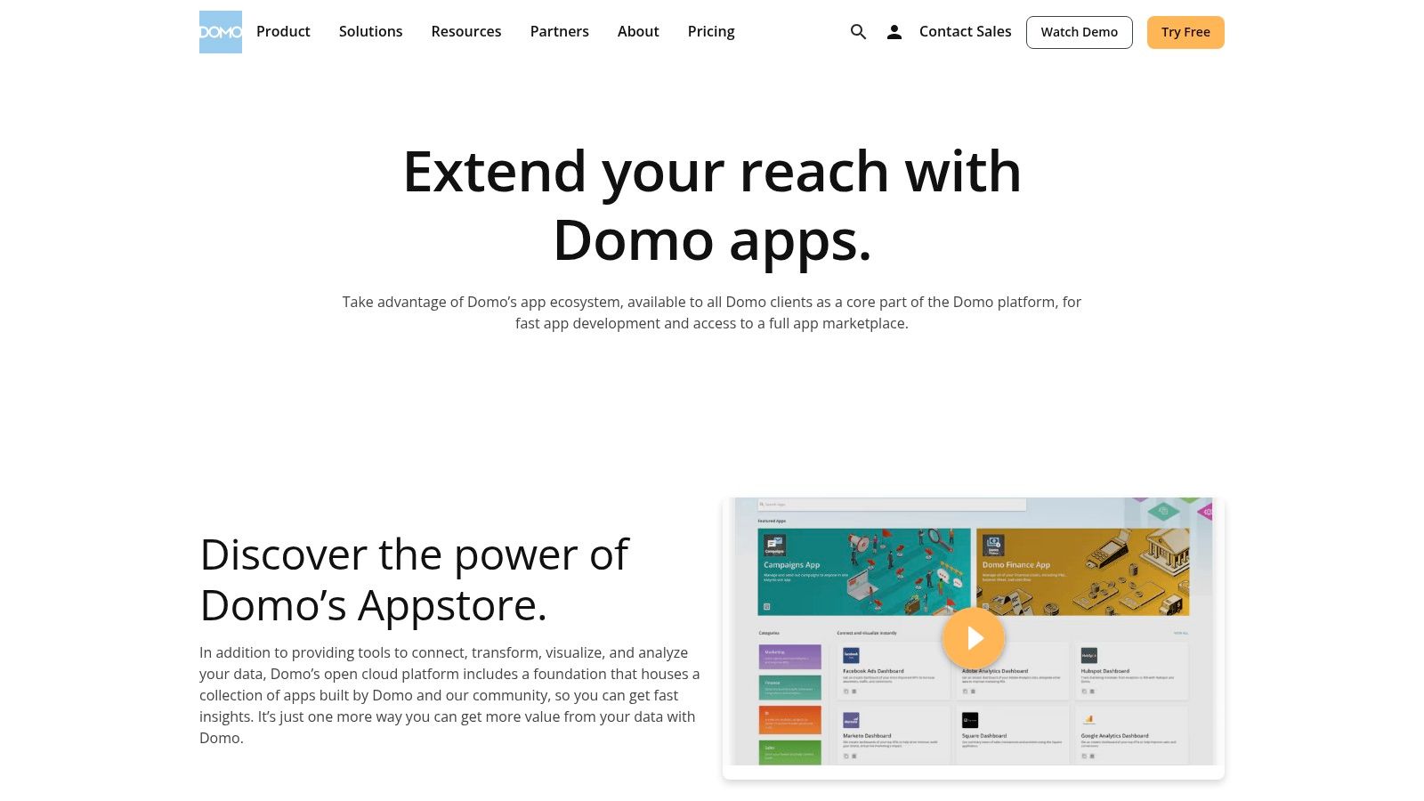
The platform’s key differentiator is its emphasis on turnkey solutions. These are not just static images but fully functional apps powered by a vast catalog of over 1,000 data connectors. This means a marketing manager can instantly deploy a “Marketing Attribution” dashboard, connect it to their specific data sources, and begin generating insights in a fraction of the time it would take to design and build one manually.
Strategic Breakdown & Key Takeaways
The Domo Appstore serves as a strategic accelerator for organizations that need to prove the value of BI quickly. By leveraging pre-built apps, teams can bypass the initial design and development hurdles and focus immediately on data analysis and action. The marketplace structure also fosters a rich partner ecosystem, ensuring a continuous supply of updated and specialized business intelligence dashboard examples.
Actionable Insights:
- Filter by Role or Industry: Begin by browsing apps specific to your function (e.g., Finance, HR, Sales) or industry (e.g., Retail, Healthcare) to find the most relevant, ready-to-use dashboards.
- Assess Connector Requirements: Before selecting an app, identify the data connectors it requires. This ensures you can properly feed it with your company’s data, which is foundational to a successful BI setup. Learn more about the data integration processes known as ETL pipelines.
- Use QuickStarts for Inspiration: Even if you plan to build a custom dashboard, explore the QuickStart apps to gather ideas for key performance indicators (KPIs), chart types, and layout designs that are proven to be effective in your domain.
Platform Details
FeatureDescriptionPrimary OfferingA marketplace of pre-built dashboard applications, QuickStarts, and over 1,000 data connectors.Unique FeatureThe ability to deploy fully functional, industry-specific dashboard apps directly into the Domo platform.Access & PricingBrowsing is free, but deploying and using apps requires a Domo subscription. App pricing varies.Best ForBusinesses seeking rapid BI deployment, teams with limited design resources, and managers needing proven templates.
Website: https://www.domo.com/automation/about-appstore
7. Metabase – Example Dashboards and Templates
Metabase offers an official hub of example dashboards and visualizations that emphasize simplicity and rapid deployment. Unlike more complex platforms, Metabase focuses on clean, accessible, and easily replicable business intelligence dashboard examples. Its open-source nature makes it a powerful choice for startups and technical teams who want to build effective dashboards without a steep learning curve or significant upfront investment.
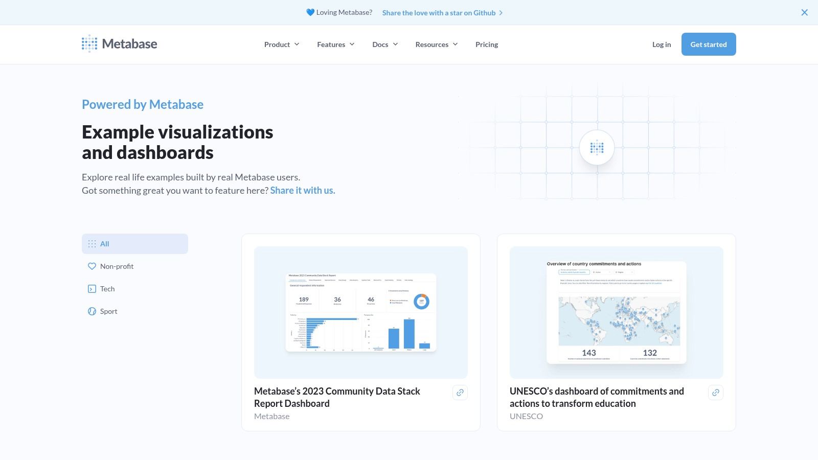
The platform’s key differentiator is its straightforward, “get-it-done” approach. The examples provided are designed not just for inspiration but for quick implementation. Interactive “Explore dashboard” features allow users to click through and understand how filters and questions work together, providing a clear path from viewing an example to building a similar one within minutes.
Strategic Breakdown & Key Takeaways
Metabase’s examples serve as practical blueprints for common business use cases, such as SaaS metrics, e-commerce sales, and project management tracking. The focus is less on artistic visualization and more on functional clarity, ensuring that teams can quickly answer critical business questions. This pragmatic approach empowers users to build dashboards that deliver immediate value.
Actionable Insights:
- Emulate Core Logic: Use the examples to understand Metabase’s question-and-answer logic. Replicate the structure of a sample dashboard by first building its individual component “questions” before arranging them on a new dashboard.
- Focus on Simplicity: Observe how Metabase dashboards use minimal chart types and clean layouts. Avoid over-complicating your own designs; prioritize readability and speed to insight over visual complexity.
- Leverage Self-Hosting: For technical teams, the ability to self-host Metabase is a significant advantage. Use the examples as a baseline for a custom, internally managed BI solution that can scale with your organization.
Platform Details
FeatureDescriptionPrimary OfferingA collection of clean, functional dashboard examples and templates for various business use cases.Unique FeatureOpen-source flexibility, allowing for free self-hosting or managed cloud options for easier deployment.Access & PricingViewing examples is free. The platform can be self-hosted for free or accessed via paid cloud plans.Best ForStartups, small to mid-sized businesses, and technical teams looking for a simple, fast, and replicable BI tool.
Website: https://www.metabase.com/examples
Business Intelligence Dashboard Examples Comparison
PlatformImplementation ComplexityResource RequirementsExpected OutcomesIdeal Use CasesKey AdvantagesTableau – Dashboard ExamplesModerate; requires Tableau Desktop or Cloud for full useLicensed Tableau software; internet accessHigh-quality, customizable dashboardsBusiness intelligence learning; diverse industriesCurated examples; strong community and learning resourcesGoogle Looker Studio – Report GalleryLow; easy one-click template useFree access; Google ecosystem servicesFast deployment of marketing/analytics dashboardsMarketing and analytics data visualizationFree, seamless Google integration; quick template useMicrosoft AppSource – Power BI AppsModerate; Power BI Pro license neededPower BI Pro license; installation within Power BIPlug-and-play BI apps with sample dataIndustry-specific Power BI usersCurated, rated apps; direct integration with Power BIQlik – Dashboard ExamplesLow to Moderate; mostly demosQlik platform access for trialsDashboard design inspiration; KPI understandingBI design learning; assessing Qlik platformReal-world layouts; AI and associative engine demosAmazon QuickSight – Dashboard GalleryModerate; AWS QuickSight subscription requiredAWS account and QuickSight subscriptionIndustry and AWS-focused dashboardsAWS users; cost optimization scenariosAligned with AWS data; business/FinOps use casesDomo – Appstore (Dashboards, etc.)Moderate; requires Domo subscriptionDomo account and subscription; possible purchase costsReady-to-use dashboards and connectorsRole- and industry-specific quick deploymentsExtensive connector library; vetted partner appsMetabase – Example DashboardsLow; open-source, easy setupOpen-source or cloud hosting; minimal costsSimple, adaptable dashboards for teamsStartups; small teams; open-source usersOpen-source; clean examples; easy replication
Powering Your Next Dashboard with Real-Time Data
Inspiration is the first step, but execution is what delivers value. The business intelligence dashboard examples we’ve explored from tools like Tableau, Power BI, and Looker highlight a critical, unifying theme: the most impactful dashboards are fueled by fresh, reliable, and timely data. A well-designed dashboard is only as good as the data feeding it.
Stale data leads to flawed insights and missed opportunities. To build a truly dynamic BI environment that empowers proactive decision-making, you need a data infrastructure that can keep pace with your operations. This is where modern data movement platforms become essential.
For instance, a solution like Streamkap utilizes Change Data Capture (CDC) to stream data changes from your source databases (like PostgreSQL or MongoDB) to your warehouse in real-time. This approach eliminates slow, resource-intensive batch processes and ensures your dashboards in tools like Qlik or Amazon QuickSight always reflect the current state of your business. This empowers your team to make decisions with confidence, speed, and accuracy.
Key Takeaways from Our Dashboard Examples
Reflecting on the diverse business intelligence dashboard examples from Metabase to Domo, several core principles emerge as non-negotiable for success. These dashboards are not just data visualizations; they are strategic assets designed for specific outcomes.
- Clarity Over Clutter: The best dashboards prioritize information hierarchy. Key Performance Indicators (KPIs) are prominent, while secondary metrics provide context without overwhelming the user.
- Audience-Centric Design: A sales dashboard looks vastly different from a financial or operational one. Effective design always starts with understanding the end-user’s goals, questions, and required level of detail.
- Interactivity Drives Insight: Features like filters, drill-downs, and hover-over details transform a static report into an exploratory tool. This allows users to move from “what” happened to “why” it happened.
Your Actionable Next Steps
Translating inspiration into a functional, high-impact dashboard requires a structured approach. Use these steps to guide your next project.
- Define the Core Objective: Before choosing a single chart, clearly articulate the primary business question this dashboard will answer. Is it to monitor sales performance, track marketing campaign ROI, or oversee operational efficiency? A clear objective prevents scope creep and ensures focus.
- Select Your Metrics Wisely: Identify the 3-5 primary KPIs that directly measure your core objective. Then, choose secondary metrics that provide necessary context. Avoid vanity metrics that don’t lead to actionable insights.
- Choose the Right Tool: Your choice of BI tool depends on your existing tech stack, budget, and team’s technical skills. Power BI integrates seamlessly with the Microsoft ecosystem, while Tableau is renowned for its visualization flexibility. Looker Studio offers a great starting point for those heavily invested in Google platforms.
- Prioritize Your Data Pipeline: This is the most crucial, and often overlooked, step. To avoid building a dashboard on outdated information, you must establish a real-time data pipeline. Assess your data sources and implement a solution that ensures data flows continuously and reliably into your data warehouse. Without a solid data foundation, even the most beautiful dashboard is useless.
Ultimately, the goal of any BI dashboard is to shorten the path from data to decision. By combining thoughtful design with a robust, real-time data infrastructure, you create more than just a report. You build a command center that drives strategic action, fosters a data-driven culture, and gives your organization a definitive competitive edge.
Ready to ensure your business intelligence dashboard examples are powered by data that is always up-to-date? Streamkap uses real-time CDC to stream data from your operational databases directly into your data warehouse, eliminating stale data and empowering your BI tools with live insights. See how you can build a truly real-time dashboard by visiting Streamkap today.
Related resources
Kafka Consumer Lag: Causes, Debugging, and Fixes
Consumer lag is the most common Kafka operational issue. Learn what causes it, how to measure it, and practical strategies to bring it under control.
Kafka on Kubernetes: Real-World Lessons
Running Kafka on Kubernetes sounds like a good idea until you hit storage, networking, and operational challenges. Here's what teams learn the hard way and how to avoid the common pitfalls.
Backpressure in Stream Processing: What It Is and How to Handle It
Learn what backpressure means in streaming pipelines, how to detect it, and practical strategies for handling it in Kafka, Flink, and CDC pipelines without losing data.